Futurestay
This new SaaS platform helps enable short-term rental owners to manage multiple properties through multiple platforms. The logo needed to portray themes of simplicity, intelligence and inclusivity. The origami theme speaks to the DIY nature of what we termed as “rentalpreneurs”.

Vinewood Originals
This is a logo done for a local custom wood worker, he wanted it designed so that it could be made into a 6x6 metal cut sign for the front of his shop.
Custom Kings
Harley Davidson hired me to create a logo for their Custom Kings street battle. It needed to include their Dark Custom logo and serve as a campaign logo that would appear on web, print and video assets.

Lindcroft
Where childlike imagination and audacity meet uncompromising design and meticulous craftsmanship to create uniquely magical spaces. This design and construction company required a logo as magical as their positioning statement. The alchemy symbol for earth with the feather of a Raven mixes themes of resourcefulness and ingenuity. Two of the qualities it takes to create magical spaces.

Phantom Compliance
Being in the Crypto Compliance industry, these guys were lining up nicely for a logo with some web 3.0 flair. Doing it all under the radar as a white label service meant they were lining up nicely for a ninja ghost.

The Way
Using inspiration from the Tao, I created this logo to visually communicate themes of inner balance and harmony. A classic black and white palette help to communicate the yin and yang associated with a well balanced life.

Tried and True
Logo concept for a new Culture Guide Ezine. Truth bombs start dropping spring of 2019

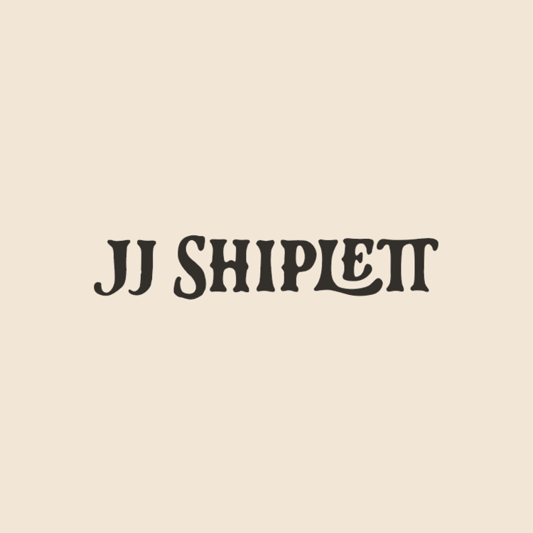
JJ Shiplett
An Alberta born singer-songwriter and performer that has captured the attention of music fans across the country. This Alt-Country artist needed a logo that portrayed his honest and grounded approach to music. Custom hand drawn lettering felt like the obvious approach.

Isana Sushi
Tapped out on sushi yet? NEVER. This logo was inspired by Japanese tradition and the colours of the sea, along with the tasty edibles that lie within.

TUA Financial
TUA Financial needed to appeal to a younger demographic so I created a visual brand that captured a professional but energetic tone. This logo builds trust while creating a welcoming tone with millennials.

Sundance Prairie Products
The concept behind this logo was to create something clean that would challenge the preconceived notions behind the Cannabis industry. Clean, crisp and professional.

The Brigade
I approached this brand with the goal of creating something that resembled a band of freelancers that has set out to disrupt the advertising industry. We ended up with something bold that reflected this new creative revolution.
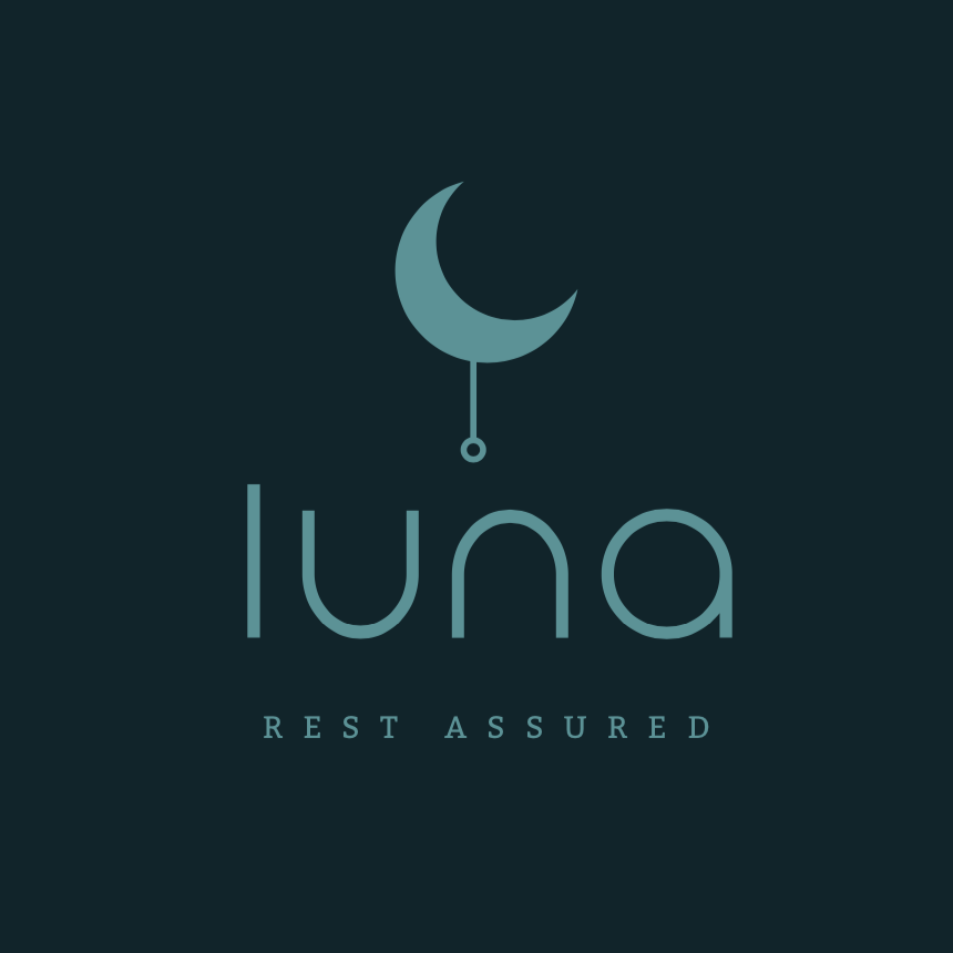
Luna
This business specializes in producing high quality, but affordable mattresses. We wanted the brand to feel friendly and approachable, while communicating concepts of quality experience. This simple approach gave the brand a minimalist feel, helping produce a calming and assured feel.

Airdrie Hawks
Airdrie Volleyball Association approached me for a logo that offered a modern sports aesthetic while keeping a classic approach to athletic branding. The result was a bold, progressive serif font with a custom stylized hawk, with plenty of personality for their lively group of volleyball athletes.

Proud Mouth
Proud Mouth approached me wanting to create a visual brand that communicated the bold, outspoken mavericks that they are. The colour palette incorporates a strong, bold red with classic navy blue to create something professional yet evocative.
Mini Monet
The logo was done for a children’s art school. The client wanted something playful and whimsical, but also wanted something that would give the school a level of professionalism.

Good Fellow
This logo was created for a local gardening business who prides themselves on their friendly, neighbourly approach to business. We wanted to produce a local feel and capture the humble beginnings of the owner Adam. Turns out he wears gardening hats and has an epic beard. Made my job easy, and fun!
Lauren Mayell
This is a logo I designed for a local Country Music musician in Calgary. After an extensive personal brand discovery process we uncovered the bold yet mild nature of this artist. Her logo represents this contrast with a rose growing out of a pistol, the font used is a modern tip of the hat to a classic western serif typeface.